How streets influence UI design
A few months back, a designer friend of mine was working on a review of a Chinese App. I could see his concerns about information density and lack of white space or room in the app design. My designer friend is from one of the most affluent Scandinavian countries. His design sense is precious and precise.
I reasoned with him. I explained that the design of UX things is very cultural. The fact that in Europe, people wish to make rules that work in their context and expect the whole world to follow them or make them as a benchmark is not justified. It is a remnant of post-colonial thinking. We should think of design in more plural ways. This is especially more relevant since these 'design objects' will not be used European context by people who have germinated in European aesthetics.
He tended to agree. But, this discussion made me more curious. Where does this visual aesthetic come from? I am no anthropologist, but I think, I have a good hunch here.
I think it comes from the day-to-day information density, especially in the streets. It became more clear on my recent visit to India. Hear me out.
Streets
Before we proceed, let's define information in this context: Any present artefact that triggers a cognitive task (reading, analysing, ignoring) for the native population.
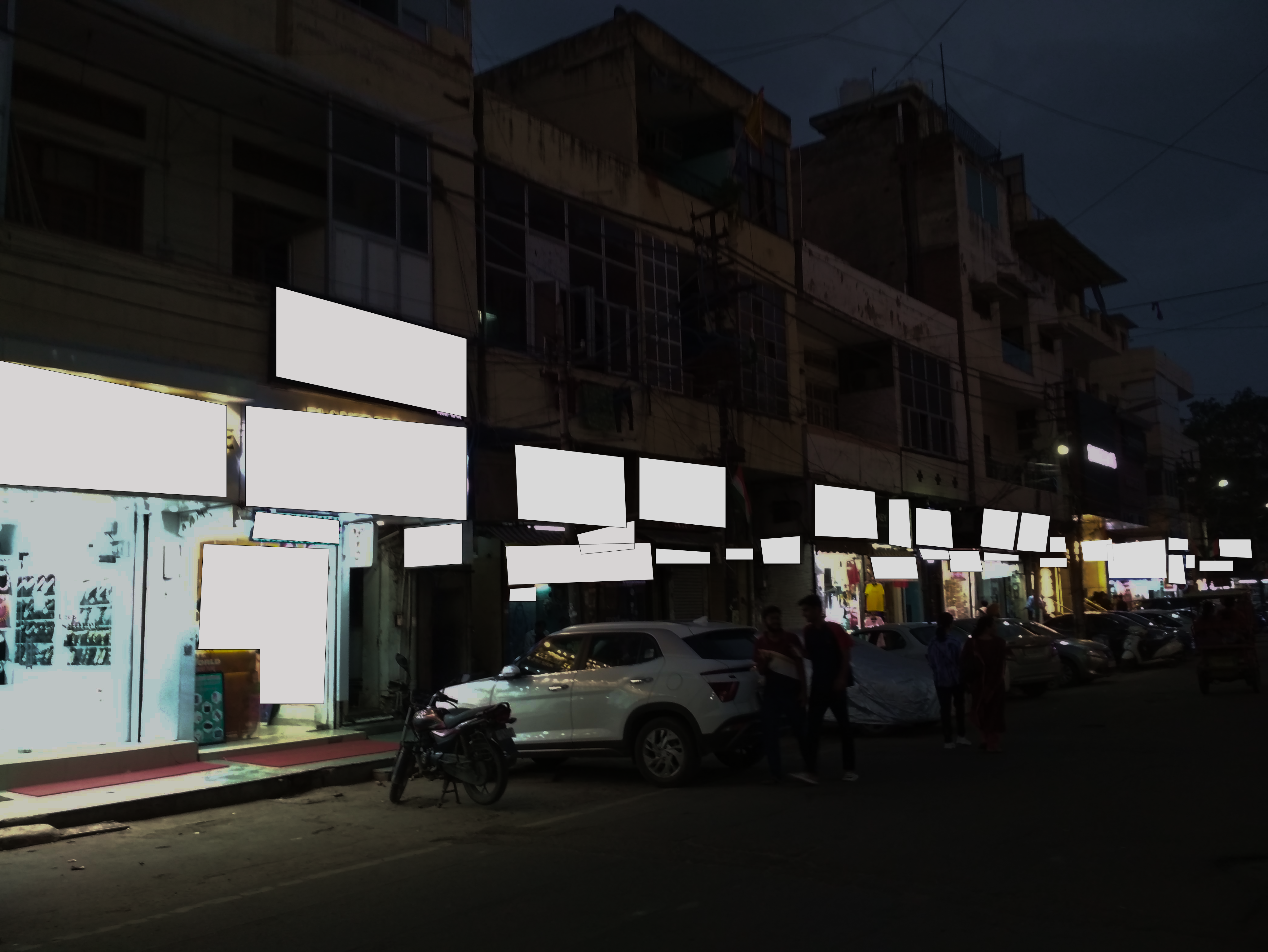
This is a typical neighbourhood in New Delhi.

This is the street highlighted with 'information' elements.
This is a typical street in China.

This is the street highlighted with 'information' elements.

and this is a typical street in Stockholm on a rather rare sunny day (Somewhere near Södermalm).
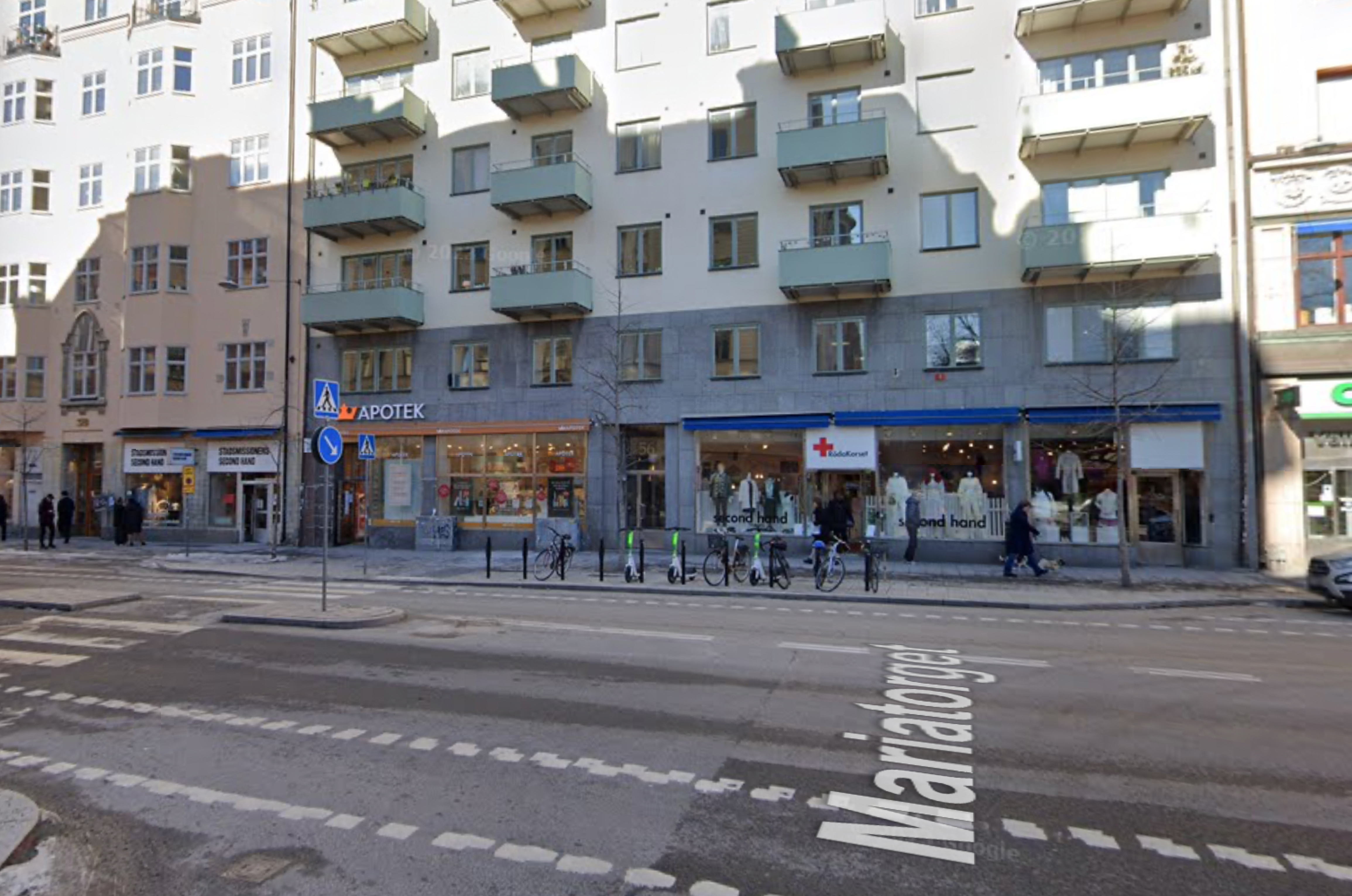
This is the street highlighted with 'information' elements.
Apps
One can easily spot that population density leads to higher information density on the streets just because there is less space per unit population. This can easily be seen in popular apps in these countries and the concept of 'white space' (funny why it is called white space 🤭) is not very relevant in many Eastern cultures.
Let's look at popular apps in these countries
This is a popular app from Sweden: Klarna

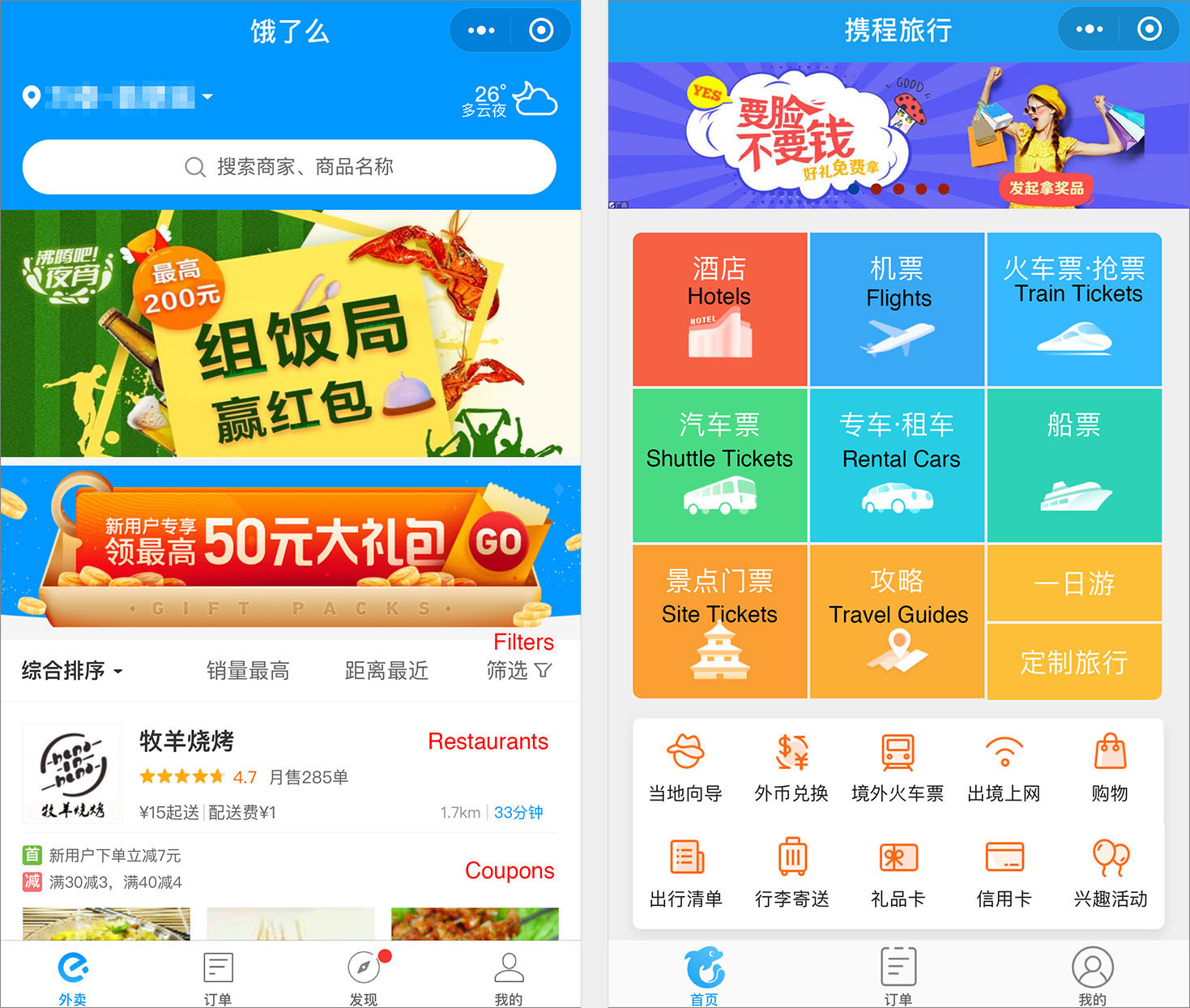
This is a popular payment app from India: Paytm

This is 'the' app in China: WeChat
Also, check this interesting article by NN about UX lessons from WeChat
Discussion and Questions
There is some evidence that population density among other factors influences how people in those cultures design apps. Some cultures may be able to deal with high information density with a need for more roomy designs.
Another question that comes to my mind is that a lot of my designer friends stress the need for more roomier designs. It seems it does make things clearer as the information presented per screen is low. This increases the responsibility of an information architect who can structure information well. However, this structuring is again highly context-driven. Hence, many times, app companies in India would put everything up front. I am guessing that these designs convert better in multivariate testing.
Having asked this question to my non-designer friends in India, the answers were quite interesting. Many associate less dense apps as good, aspirational, imported, and clearer. Someone even said it is like IKEA furniture, simple and just. They will probably be more likely to install them and perceive higher quality. However, they consider apps like Paytm, Swiggy etc. as more useful in the long run. They tend to develop 'screen memory' on these apps as people do on TV remote controls. Hence, after a few weeks, they can easily spot what they need, rather than navigating menus on the cleaner apps. Designers of these 'should' avoid changing things too much.
A thing that does not get talked about a lot is these apps have a 'cultural memory' too. People use them daily. Like they use the streets daily. Any major change in the streets, like in apps, draws attention and probably creates confusion.
Do single-purpose apps (banks) benefit from visually less dense designs vs. multipurpose apps (Neo banks)? I am not sure. I will give it a maybe. I think, here is someplace we can use prediction modelling to see how we can bring things people might need higher up and keep the interface less visually dense. Apple does this beautifully. If you use Apple Maps, it will recommend the location based on upcoming calendar events.
Do frequently used apps, benefit from visually dense designs? I do not know, but it is a good research question for a CHI paper.
How is the learning curve of visually dense apps versus less dense apps for the same cognitive task? Another CHI paper, probably already written somewhere. Let me know if you find something along these lines.
Conclusion
First of all, thanks for reading till here. You are a champion for having such a long attention span.
My conclusion here is very simple.
Given the small study, It seems like : Population Density ∝ High on street information density ∝ High on-screen information density
Another more holistic take-away for designers is context. Any good design school teaches us the value of context when designing design artefacts. Unfortunately, as we get thrown inside the hamster wheel of the UX industry, we hardly have time to spend time in the context and design meaningful things. Context is everything. In one of my upcoming articles, I will talk about how digital India needs re-contextualisation and needs to understand the culture it operates in.
So long, Rohit